Welcome to Pure Warfare - The #1 Community for Pures
- Start new topics and reply to others
- Subscribe to topics and forums to get email updates
- Get your own profile page and make new friends
- Send personal messages to other members.


TRiXx
-
Posts
262 -
Joined
-
Last visited
Posts posted by TRiXx
-
-
NOT BLOODY GOOD ENUF TWIXXY
;d
Lol whats up Hugh?
-
Yea some of you guys know me some of you may not but awile ago i got the graphics team rank and was extremely inactive. I apologize for being so inactive I had some serious problems with my computer and just now got it fixed. I hope I didnt **** anyone off too much lol. Just wanted to apologize to the staff and to anyone who asked for something a few months ago. Ill be a little more active on these forums in the coming weeks :D.
-
Taught me how to kill a man.
-
Double Post .
-
way too bright for my liking.
-
As long as she doesnt get pregnant im cool lol
-

Basically 25 def max mage besides the fury and ring of life.
Am at rock lobs so it was the best I could do!
Thanks, itll be put too good use
-
Googled max 20 def gear, result;

I need scimmy/whip/or a weapon showing and would prefer a hi def screeny.
-
Where the hell is rick james when you need him
Hes out stomping couches
-
-
Rofl Trixx is so ******* random kid bearly gets off his xbox But thats why I love him <3
Do i have to beat you up lol? <3
-
Not visiting porn sites
-

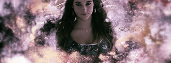
*NOTE: JUST CRITIQUE THE F AND THE I NOT THE BACKGROUND *
This is the first two letters for a halo reach teams team name "First Class." I am trying to develop a font for their logo thats completely original and because of my lack of a scanner I have too use the pen tool which I am horrible with. These are the two things im asking, first, what do you think so far of the original text give me some opinions. Second, does anyone have any good pen tool tuts for photoshop they could link me? All thanks appreciated.
-
Weldone Aidan/Mo/Dramatic especially. Goodjob everyone else :)
I see how it is lawson
-
The left side seems a little too open but none the less good job :P
-
Debating on applying or not
-
The first one doesnt seem too have alot of flow for me, but nice effects. The second I believe has the best flow out of all of the entries. I cant decide who too pick lol.
-
Gl to all, Stinks for Trixx :( youll get them next time
Its all good it was something too do while bored ;p
-
Ill try something with the 3rd stock
EDIT : I may make a revision too it later
* You must send your entry to host, if posted on topic or anywhere else - piece will be disqualified.
FACEROCKET
I can vouch that TriXx most definitely didn't know this, as it hasn't been introduced on PW before, Therefore he just assumed that he didn't have to message you, so he just posted it. :nuke: :nuke: :nuke: :dotfire:
If I give it to Trixx; (the privilege to post it here - than I'd have to allow other people. Which I'm not alright with.)
Trixx - Sorry mate, no special treatment :(
Its alright I understand, rules are rules :P
-
Ill try something with the 3rd stock
EDIT : I may make a revision too it later
* You must send your entry to host, if posted on topic or anywhere else - piece will be disqualified.
FACEROCKET
Haha stuff has changed since ive done this oh well, it was fun too do while i was bored lol.
-
i hate how people try to say how some1s sig needs to get some of this or some of that
they all need to shut the **** up, art is art, you don't change it for someone else's opinion to be pleased
Im trying to get opinions to help improve myself as a designer.
Thanks for not quoting me -.-'
:teehee:
Haha i read your comment and i really appreciate it :D
-
Ill try something with the 3rd stock
EDIT : I may make a revision too it later
-
i hate how people try to say how some1s sig needs to get some of this or some of that
they all need to shut the **** up, art is art, you don't change it for someone else's opinion to be pleased
Im trying to get opinions to help improve myself as a designer.
-
Don't really like the last one but the pentooling is good.
The first two have great effects although there's a lot going which is bad and as always text can be improved. Also the sharpness as they've said.
i always have issues with text lol ;p

Sorry for Being Inactive
in General Discussion
Posted
Oh everythings good man, what channels do you sit in because with being gone so long i got noone to talk 2 in irc lol