Welcome to Pure Warfare - The #1 Community for Pures
- Start new topics and reply to others
- Subscribe to topics and forums to get email updates
- Get your own profile page and make new friends
- Send personal messages to other members.


-XQ
-
Posts
150 -
Joined
-
Last visited
Posts posted by -XQ
-
-
Was a good run, respect every member in CTRL.
R.I.P.
-
Really like them, just think the text doesn't really coinside with anything in your other tags,
The last one more than most!
Goodjob though, Like the first one and really love the lighting effect on the second. :)
-
-
I too am really experienced at this kind of stuff :(
Only CC I can give from a viewers perspective would be uh;
As said, the clipping masks are slightly distracting, but I do get what you're trying to express with that but would be more effective if what she was looking at was shown :O
The main C4D in the picture is good imo, if you want cc on that id suggest the colours, matching the colours with the focal sort of thing.
Really like the typography
And the depth makes the signature as a whole stand out.
I really like the colouring and lighting too,
all in all, goodjob!
*edit: Oh and the white boarder is different too! I'll have to try that out. :')
-
I've always been a fan of your work! I loveeeeeee the second one!
Thanks!
The second one at a lack of creativity on my part, I couldn't think of a club name so I looked at my mates phone and thought that was pretty good, Xperia. :')
-
I kind of like the first, but the 2011 looks off to me.
^This
-
Thanks guys, Im looking for ideas for the next poster though!
I think Im gonna make a pendulum poster.. all pendulum posters are bad according to google images.
some suggested sillhouttes and stuff
And I thought of doing their logo in 3D.
Should be fun for me.
But yeah if you guys have any ideas, shoot them across!
-
-
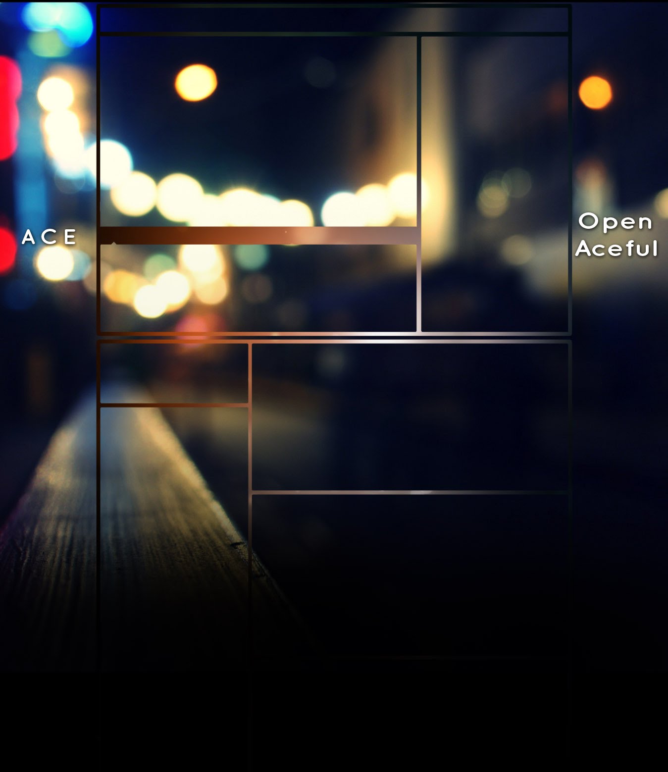
Hi!
I got bored and felt like creating something on photoshop at like 3am in the morning.
Then ace (The rapper guy) posted his new song, his graphics didnt look too good, and I really liked his songs.
So I offerd to do some graphics for him free of charge from talking to him for a few minutes.
I really enjoyed creating these for him :)
Youtube video type image:
(He wanted 'ace' or 'openace' in the picture and a sort of city scape)Spoiler:
http://i2.ytimg.com/bg/Yj_GOxWAz3e_woo1Bil...&v=4e71a3a6
^
Thats the background image for youtube I made (Nothing special atall) But It mildly sticks with a theme and doesnt look too bad.His channel:
http://www.youtube.com/user/OpenAceful
Update;
The youtube video image didn't turn out as good as I hoped, so I modded an older piece I made and seen if he liked it.
-
Hey friendly family of graphic designers.
Here's the story;
I've just been offerd a sort of oppertunity to go into promotion work for clubs around by my local area, and I myself have had ZERO experience in actually producing stuff and that.
Ideally I wanna make posters, but Ive come up with a few quick, shite concepts for posters
If you could be a HUGE help and give me a sort of concept idea for a new poster I can show these recruiters?
As you will see, I tried an INDIE style poster, and it fails hugely.
Like I said, I'm not too much looking for crit on the posters, just a show of what I have so far and to ask you to give me some ideas for a next one?! :D please :)
My favorite, done for a project in collegeSpoiler: MehSpoiler:
 #IndieWannabeFailSpoiler:
I'm not really looking for crit, more of new ideas for new posters! -
-
Zenith proving once again they can't beat CTRL matched.
-
Slightly controversial amongst the gfx'z.
I tried something just before i thought about sotm which was a large art'ish piece i did,
Nothing special as you guys pointed out, but I liked the outcome;

I realised that the entry deadline was the 20th, and on the day i finished, I just downsized the piece and added a few more effects.
On a side note aswell for the haters, my entry was added 18 votes in fyi.
Thank all for voting for your SOTM anyway, glad to see the poll is really active.
-
Goodluck all
-
-
-
Well IMO, when your entering a competition with certain limitations, you should.
Imagination is limitless, not confined to certain size standards, if you had an idea, you'd have to scale it down to suit the rules set by the person in charge.
But yeah, no point in complaining about a graphic forum, if you don't like it just switch.
Getting mad over an offbeat competition on a runescape forum, seriously?
And for the record, I wasn't saying 'all this crap' I was telling you to stop complaining and get on with it.
-
Not gonna lie, but why is everyone crying over people voting for what they think best?
This is a runescape related forum, this just happens to be a graphic section to a runescape related forum.
Obviously you're not going to get the most experienced graphic designers coming here to vote on SOTM.
You're going to get people voting for what they think looks best, ones for there reasons think is best.
Stop ******* moaning about how people won't understand your work, target the audience instead of trying to justify with saying one piece has all these complicated methods to make it come out in such a such way.
-
Ya, I don't normally add text like ever to a piece, 'cause I know I can't pull it off atall. Just felt like adding where I got the idea of it from and I can see what you guys are saying about the LQ.
Anyway cheers. :)
-
Something that i'm not used to doing, but I don't think it's as bad as you're making it our to be, with ONE good point and SEVEN bad points.
-
Got bored and used an old stock (I think from Aidens pack)
Inspiration^
(+ The song is free :) )
--------------------

-
ffs I like the last one the best but it wasnt up there when I voted.
Yeah, he put it up around 18 votes into the topic, which is facedesk.. :l
-
Oh I did submit on the 20th but hasnt been enterd. :S
Saved all the entries last night and didn't realize I had a new message. My mystake, sorry. Your entry is added.
18 votes later :S
I know I didn't really have a chance of winning, but 18 votes later? come on.
-
Oh I did submit on the 20th but hasnt been enterd. :S


RIP Ctrl
in Graphics
Posted
If you wanna support then go ahead :)
Thanks :)